May 12, 2014
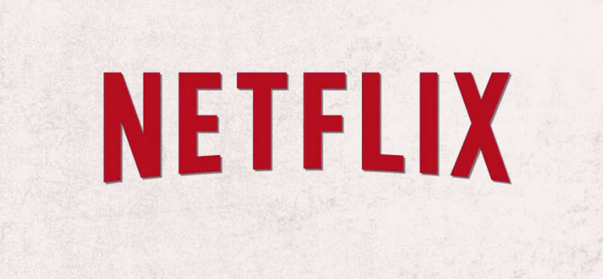
Many of you may not know, but the large online TV streaming company has started using a very clean flat logo in some of its promotional material, including the trailer for one of their original series. Netflix has not commented if this marks the beginning of a complete revamp of their branding, or they are simply testing the water. In the past we have seen companies roll out new logos and have had a negative response, so perhaps Netflix is waiting to see what people have to say before taking the plunge and promoting the new logo on their marketing collateral and website.


The changes in the logo may be simple, but give the logo a new modern feel. We have seen many other companies switch from dimensional logos into flat design, including Google and Olive Garden. With it’s new logo, Netflix was able to keep a form of their iconic red color, but by taking away the jarring red background, the logo on screen does not pulsate and is much easier on the eyes. Not only is the logo easier on the eyes, but is viewed better visually at small scale compared to the old logo.
We are curious to see how the logo change plays out, and whether or not Netflix will implement it fully, or pretend it is not happening.
